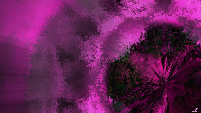
Amethyst Within
This image is made from scratch, so no stock photos this time. I decided I have used a lot of blue and red, orange and red, as well as purple and blue, so why not change things up. I took my own advice from last post and tried something new, and I like the results! I call this one Amethyst Within and I think it is awesome!
You normally think of pink as being a bright, girly color that is happy, but I was playing with blend modes and when the darker image came up, I knew that is where I wanted to go. I also did something different, where the pink and grey background I made and used before everything else, is on top of everything.
So say I created layer 1, then layer 2, then 3 and so on. Instead of keeping them like that, I stacked them like 3 on top of 2, which is on top of 1. More layers obviously, but you get the idea. I then asked my wife what a good name for it would be, and she said anything with the word Amethyst, since it looks like one. I didn't know about that gem, so that is how the name of this piece came to be.
Anyway, I hope you enjoyed this installment of JulioCoolio PDN Pictures, and I'll see you here soon.


Comments
Post a Comment