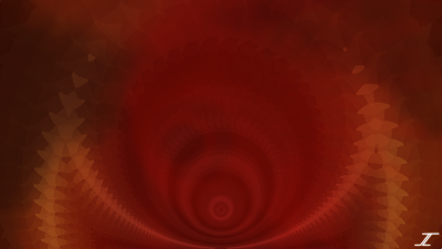
Posts

Showing posts from 2019

Spirit of Kwanzaa

Image
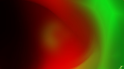
Happy Kwanzaa! Here is the last of the December Holidays. I knew the colors of Kwanzaa, but had to look them up to make sure they were right. I then started with a red background and had the red in the middle, while I had black and green added on both sides. I'm not sure if the order of the colors matters, but if it does, I apologize for that, and I'll do better next time around. Here is the image called Spirit of Kwanzaa. I mostly used Polar Inversion, and Radial Blur. I then used the layer blend modes Additive, Lighten, and Difference to give it the look that it does. I had fun with this little project of December Holidays and I hope that next year I'm able to do it again. If you have suggestions for other images or projects make sure to comment below or email me those ideas.

O Christmas Tree

Image
Merry Christmas! I hope that you are all having a great time and that you got to spend time with those that mean the most to you. I created this image a while ago, but decided to wait to post it until now. I had a vision in my head about what I wanted to do for a Christmas image, and I wanted to do a close up of a Christmas Tree. I found a tutorial on the Paint.NET forums and gave it a whirl. It wasn't difficult, just a bit time consuming like the tutorial said, but I got it looking how I wanted it to. I then added the orbs and lights to the tree which made it seem a bit more real. I then decided to try to add some texture to the wall and I did that using a rendering called Clouds, and then I made the wall a little transparent to allow the texture to come through. Aside from that, not many effects were used, nor layer blend modes. I hope the holidays are good to you all!

Hanukkah Celebration

Image
Happy Hanukkah! Here is the first of the December Holidays that I mentioned. I looked up the colors of Hanukkah and they were blue and white, so I got started with those. I wanted to do a bit more like I usually do, but I had a certain combination of layer blend modes that I really liked so I couldn't do much more than what I have here. Here is Hanukkah Celebration. I did a few effects that you can see right off the bat. Radial Extruder, Radial Blur, and Polar Inversion were all used here. I also used Darken and Overlay as the main layer blend modes. I think it looks pretty good, not what I was going for, but I think it still looks pretty good. Enjoy and I'll see you here again soon.

December Holidays

I had a thought of doing a December Holiday series and posting an image for three holidays that I know of in December. Those holidays include Hanukkah, Christmas, and Kwanzaa. Reason I am wanting to do that is to include all of the holidays instead of just doing Christmas like I have been doing. I hope you enjoy that and I'll see you here with the first image on the 22nd.

Fall at Dusk

Image
I got access to my new computer again, so look forward to my style going back to normal. Anyway, autumn has taken its toll, the days are getting shorter, and temperatures are dropping in the northern hemisphere, but that doesn't mean that the beauty is gone. Personally I like summers better, but at least it's not winter..yet. This image kind of depicts how it looks when it starts getting dark outside, so I present Fall at Dusk. Not many effects were used, just Radial Blur, Polar Inversion, and Dents. The majority of the image comes from the layer blend modes which are Glow, Color Dodge, and Darken. I also got another fall color palette for this image to use for the colors on this, and so I hope that it has helped bring the spirit of fall into our hearts. See ya on the next image.

Halloween Mist

Image
Happy Halloween. I hope tonight is/was a good night for you all. Once again, I used the old Paint.NET on my older computer, but added some of my new favorite effects to use. I created this as a photo manipulation of Halloween Wolves that I made about two years ago. I then created a few new aspects of it to give you what I have here today, which I call Halloween Mist I was a bit lost in the making of this image, and it took longer that I care to admit honestly. I finally got something that I liked and it still felt like it was missing something. I then saw an eye and decided to play with that idea. The green could be the mane of the horse, while the purple is some stray mist as well, but not sure what you think of that idea. Should I rename the piece? For now, it will be called as it is. I'll see you here next time.

Autumn Awakens

Image
So a nice little surprise, but I'm going back in time with my style here. My other computer was unavailable so I used one of my older ones and lo and behold it had Paint.NET version 3.5.11, which means that some of my long lost favorite effects called Radial Blur Deluxe and Zoom Blur Deluxe still work on that version. For perspective, Paint.NET is on version 4.2.1, so the version I used to make this image is ancient in comparison. Anyway I wanted to make a nice fall image, but didn't know really where to begin. So I went on Google and got a nice dark autumn color palette, and got to work on what I call Autumn Awakens. I only used three colors in this image, and very minimal effects and layer blend modes. The colors I used were a dark orange, a dark brown, and yellow, and the effects I used were as stated above with the addition of Dents and Gaussian Blur. I flattened the image and kept working on the image as a whole to get the effects that I wanted as well.

Fading Summer

Image
September has almost gone, and it looks like summer is fading fast. It's so sad to see summer fade away for me, but things have to take their toll, but I wish that Summer would just last a bit longer. I'm not a huge fan of fall or winter. I love spring because summer is coming, but we have to say goodbye for a season (or three). To depict this, I created Fading Summer. The green is in the center, but surrounded with some yellow to show that summer is fading away and fall is coming in. I didn't use too many layer blend modes, but I did make it so that some of the layers were a bit more transparent than others. I know this is a bit of a shorter post, but I hope to have more for you soon.

Sandstone Patterns

Image
I love summer! It's a great time of year and I love going out and taking hikes, riding my bike, or just take a walk. Of course, summer has to come to a close, but it'll be back next year. Summer always reminds me of my hometown and I created an abstract image that I think looks like the patterns that show up in Sandstone. I actually took the full size image of a Sig I created a while ago of a dragon from the game Starcraft. With that image, I distorted it until you see the new image called Sandstone Patterns. I used my classic effects such as Radial Blur, Polar Inversion, Glass Vignette, and Radial Extruder to get the effects that I wanted. I then used a few blend modes such as Multiply, Glow, and Color Dodge. I then merged the entire image and did a few more distortions, but I didn't like it as much since it covered up some of the different patterns I initially saw, so I took it out. I hope you all enjoy and I'll be back with another image soon.

Death's Flower

Image
I was wanting to make a dark image this time since I make a lot of bright images. I'm sure we all have a time in our lives where it seems that the darkness doesn't allow us to move forward with our lives. Either the death of a loved one, or a breakup, or some other trial that comes our way. I hope that this image can depict what that feels like in an abstract way. I decided to go with my classic black and red for this one and I give you Death's Flower. Classic effects used are Dents, and Polar Inversion as well as Radial Blur, and some new favorites such as Glass Vignette and Radial Extruder. I started with a Radial Blur, changing the center of said effect a few times, then did the same thing with Polar Inversion later on too. I would then flatten the image, copy that, and then do an effect or two on the full image in a new layer. I would then blend them in with Glow and Difference to keep the dark look. Enjoy this image and I'll see you here again soon.

Emergence

Image
It's been a bit, but I'm still here. Had help with the title again on this one. I didn't know what I wanted to do with this image, but it was mostly a try at what I've done before with Radial Blur, which was changing the focus on the image depending on what I wanted done. I did that and more with this image, and so I decided that the title given was the best, so I kept the title of the image. I now present to you, Emergence, It kind of does look like something is emerging from somewhere in a field of energy when I look at it. Effects used here are Radial Blur, Gaussian Blur, and Glass Vingette. I then flattened it and copied the flattened image, unflattened the image, and pasted the image to it's own layer. I then did a polar inversion on that and applied some layer blend modes to make it look nice. Hoping this image finds you all well and I hope you have a great day.

Embedded Sunshine

Image
I'm happy. So far nearly two years of bringing you guys at least 1 new image per month! When I set out to do this, I thought it would be difficult to accomplish, but it has proven to be a good experience for me to do this. For one thing I get more images out there, and it makes me think on my toes for what other images I can get created. This one I had a bit of help on the title since I didn't know what to call it. It looks like something ancient, but not so at the same time. I had to ask my wife what she thought I could call this, and she made the suggestion of Embedded Sunshine. I used Radial Blur, Glass Vignette, Radial Extruder, Dents, and Polar Inversion for the majority of this image. I also used some blend modes that made the image not too bright with the gold and white colors, but make everything subtle and rustic-like. Not sure how it turned out, but you can decide for yourselves. Enjoy and I'll see you here again soon.

Changing Theme

Well, here I am without an image, but as you may or may not have noticed, this blog looks a little different. I decided to change things up a bit from the darker theme of the blog to a more modern look as well. Nothing super different, but I just thought you may like a bit of a different look to the blog. I hope you enjoy the new layout and look I have adopted. If you don't like the new look, just let me know in the comments and I'd be happy to either change it back or to something else that is different. Thanks again for your support and I'll see you here with another image soon.

Desert Landscape

Image
I have done another competition on the Paint.NET forums, and my wanting to enter was honestly solely on the fact that it was themed on a desert landscape. I love the desert, and have been working on different ways to make stone textures, and I think through trial and error, I have been able to make stone textures fairly well. Not the best, but fairly well. There are others on the Paint.NET forums that are way better than I am, but I try with the effects that I know. Here are the images. The first one is the sig, and the second one is the full image. I drew inspiration from Monument Valley, and it definitely helped stretch me a bit more than I would have had I not done this competition. I haven't really considered doing scenery things when I started, but with dragons, desert pictures, and now this, it's definitely a stretch and I like it. Main effects used were Crystalize, Frosted Glass, Diffuse, Clouds, Fragment, Gaussian Blur, Motion Blur, and Gradient Blocks. Then t

Desert Home Remake

Image
I had to share this with you since I made a wonderful breakthrough. In the past, I have made images with mountains where they are in shadow like in  Mountain Horizon , or when I got braver and made an image with the mountains in front with the light on them like  Desert Home . I then discovered how to make a stony looking texture, and incorporated that into the remake of Desert Home. I used some new effects such as Motion Blur and Diffuse. I also used Gradients, Gaussian Blur, and the Darken blend mode. I wrote it all down in a Notepad document to keep it safe, but may transfer it to a Word Document sometime soon. I did that so that I can remember how I did it in case I want to create more images with mountains again. I hope you enjoyed this remake of Desert Home, and I'll see you here in the next post.

Alabaster's Glow

Image
I was looking at a gemstone digging kit a while ago, and saw that it came with an Alabaster. I liked how that stone looked, that I wanted to create an abstract version of it. It took a while to get it looking right, but I think I got the orange and white looking how I wanted them to. I did a few things differently in this image too that I haven't done before and it made it turn out nice. I may continue doing things how I did and see how images turn out, but enough talk, here is the image. I used some of my favorites such as Polar Inversion, Glass Vignette, Dents and Radial Blur. I also used layer blend modes Color Dodge and Glow to give it the colors that it has. I also changed the center of the Polar Inversion when I was doing it multiple times, and that gave me a nice texture that I had never really seen before. I really like the outcome and that is what I will try in future images. Enjoy!

Underwater Crystals

Image
I was looking through some of my older images on my flash drive that I’ve had for about 10 years, and I found an image that Heat Stroke sent me when I was starting to use Paint.NET. The title of the image is called Water and I used it a bit to see how he made his images. Here is the image. I remember looking at it and thinking, “How can I make something like this? There are so many complex shapes and shading that I’m not sure if I can do this.” Little did I know that it was actually a simple program to use and that I would get better with time. Just look at my first image ever called Divided and you’ll see what I mean. I decided to use this as my stock image and I manipulated it to give to you an image called Underwater Crystals. I did a few layer blend modes so that you can see the colors and textures through the layers. I also did Polar Inversion, Gaussian Blur, Glass Vignette, and Radial Extruder for the crystal effect. I think it turned out really well and if my high scho

Lava Lamp

Image
So I did another competition that was titled Lava Lamp, and I didn't place in this one, but I certainly did learn a lot. The competition wanted just a lava lamp with no background, but I made one with a background anyway. Here are both images. Nothing too fancy here. Some layer blend modes, gradients, and blurs were used. I also used the wood tutorial for the sig entry on the wooden table. Even though I didn't place it was still a great learning experience for me and I hope to do it again soon if time permits. I have a hard time with posting two images per month as it is. I'll see you here soon with my latest image.

Signature Entry

Image
Just posting an update letting you know that I won third place in the competition titled Pertaining to a Lumberjack. It was a fun competition and it let me use some creative juices I haven’t used in a long time. Here is the sig.  I recently stumbled upon a tutorial on the Paint.NET Forums on how to make a wooden background, so I used that on the background of the sig. I then used black text and layer blend modes to make the burnt on text as well as the writing on the ax. Overall, I learned some new things and it was fun.

Competitions

I’ve been becoming a bit more active on the Paint.NET forums, and have entered into two competitions. I’ll post my results of each one when the competitions end later on so that you can see my results. If I place, I may even add some more awards to my awards page! I’m excited to show you what I have made for them and I’ll see you here soon.

Fluidic Space

Image
Remember the Trial by Fire image? This is literally the same image, but layer blend modes are a bit different and a few effects made it so that it would look different enough from the last image. This is more what I was going for the first time around, but still not really quite there. When I looked at it trying to figure out if I could add anymore, I thought it looked like a place in Star Trek: Voyager that an alien species called Species 8472 lived, so I give you their home called Fluidic Space. Like I said before, effects are pretty much the same as with Trial by Fire, but the layer blend modes are a bit different. I used Color Burn, Screen, and Lighten to keep the yellow traces in there, but also made it a bit darker with Difference and Darken since it isn’t all yellow. Enjoy these images and I hope to see you soon.

Trial by Fire

Image
Life gives us a lot of crap, and sometimes we may think that it isn’t really fair the amount of stuff we are going through. I know that if we make it though, it is a trial that will make us stronger in the end, hence the title of this post and image. This is an interesting image. I was creating this image as a yellow image at the beginning, and that is how it stayed for a long time, but then one layer blend mode changed it all and made it look like a fire image. I kind of liked it and kept it, so I give you the image titled Trial by Fire. Radial Blur, Glass Vignette, and Polar Inversion are the main effects used here, as well as layer blend modes such as Overlay, Lighten and Screen. The orange and red came as a result of the Overlay blend mode. Something else that I did was I flattened the image, copied the flattened image, unflattened it, and pasted it as a new layer. That gave me the entire image to manipulate and that is mainly what I used to get the results you see. I’m stil

Swamp Spirit

Image
I was trying to see what I could do with blue and green. I noticed I didn’t have many images like that, so I was mostly going for a nice image where green was the background, and blue was in the front. I did that, but not the way that I was expecting. Experimenting with effects usually get you mixed results, so I give you Swamp Spirit. I used Glass Vignette, Radial Blur, and Kaleidoscope is making another debut here as well. Gaussian Blur was the main blur used to give it that smooth effect as well. Dents as well were used to give it that liquid look to the background, and different layer blend modes give it that dark look in the green as well as light look in the blue. I hope you enjoyed this image and I look forward to seeing you in a bit with a new image.

Pulsating Shockwaves

Image
Not my best image, but it’s something. I created this image trying to experiment with other effects and layer blend modes. I also wanted to create a pink image, but didn’t really turn out too well. I hope that it is still worthy for the blog, but if not oh well. Here I give to you, Pulsating Shockwaves. Glass Vignette was used here again as well as Kaboom, Radial Extruder, and Dents. Several new effects and honestly, I was just experimenting with new effects here to possibly use later on, which is why it isn’t the best. That is how most of my first images were, experimenting to see what looked good. Hopefully this post was good for you and I’ll see you here with a new image soon.

Instagram

Just so you all are up to date, I opened an Instagram where I have been posting some of my images from last year. I’ll be using it to give you all some sneak peaks at what I’ve been working on and possibly post the full image that I’ve been working on there before anywhere else. Follow me at juliopdnpics.

Dying Heart

Image
I was going for a Valentines Day theme with this image at the beginning, then I realized that it was similar to other images I've made. I decided to make the heart look a bit dead since Valentines Day can be a sad time of year too. Some people may not have a significant other to celebrate with or show their appreciation. Worst case senario, a couple breaks up on Valentines Day. I made this image depicting just that and I call it Dying Heart. I created the background using the same effects as always, but a new effect is making a debut here called Glass Vignette. I also have Dents, Radial Blur and Polar Inversion in the mix. The heart I made by making half of the heart, duplicating the layer, then flipping it. I then erased imperfections and there you have it. Enjoy that rendition of a Valentines image and I hope you are all happy and well. I’ll see you here again soon.

Agate's Heart

Image
Here I have another type of stone for you, as well as attempt two. I did say a while ago that I would make stones, but I guess I have them spread out here. If you look at Elemental Power of Stone, I used the same tutorial that I got from Heatstroke a while ago to create that as well as this image. I also needed to rollback the version of Paint.NET on one of my computers to be able to create it since some of the effects needed don't work on the newer versions. I digress though, you are here to see the image that I call Agate's Heart. Zoom Blur Deluxe, and Splinter are some of the effects here. I also played around with some of the effects here and modified the tutorial so that it would meet my needs better. I think it came out looking pretty good. Once again, I have these smaller ones for those of you that don't have dual monitors, but if you would like the full dual monitor image, you can click here to download it. Let me know if you want me to continue creating im

Stone's Furnace

Image
I have a slightly unusual post, but hopefully things will make sense after you read this. So this image I attempted to follow the tutorial that Heatstroke sent me a while ago to make the Elemental Power of Stone image on the most up to date version of Paint.NET, but the attempt failed. So I decided I would try to manipulate the Elemental Power of Stone image instead. Hence you see that the same exact crystal structure is in the middle, but it looks smoother than I would have liked. It's also a bit brighter than I wanted it, but I'll make another attempt. Here is the image called Stone's furnace. I have Radial Blur and Zoom Blur along with different layer blend modes to make the colors come out. Hopefully this image is worthy of this blog and that you all enjoyed it. I'll bet by now you are wondering why I have two images for this, and that is because I made this for dual monitors which is a first time for me. These are for if you don't have dual monitors and

Deceiver

Image
I created this image a while ago and was not able to find a time to post it since there are a lot of good holidays that I was able to make images for this year. Now that it is a new year, I am taking the time to post it. I decided to choose purple and blue since I seem to have some favorite color schemes, so I decided to change it up for this one. I call this one Deceiver. Nothing really fancy used here. I used some classics like Polar Inversion, Radial Blur, and my new favorite Radial Extruder, but aside from that, not much else. I did also use some layer blend modes that made it look the way it does, hence the title of the image is Deceiver since you see one thing, but it is something completely different. I hope this new year is a good one for everyone and that you have a great rest of your day.