Posts

Somber Rage

Image
Hey everyone, it’s been a long while since I’ve been on here to post a new image. My personal life has gotten very busy and I had to step away for a while in order to continue to be there for my family. Anyway, I’m sure you’re itching to see the new stuff I’ve been up to, and to start off, here is an image that is the main part of a 4 monitor HD image called Somber Rage. I have a four monitor setup at work now, and I wanted to make an image that covered all four of those, so I got working on that. The image you see above is just a piece of that, but you can see the rest of the pieces below. I started with some colors that I liked from an album artwork of a music group that I like, and went from there. I added color on one side of the image which is the red color, manipulated it greatly until it filled up that side using my classic Gaussian Blur, Dents, and Radial Blur effects, then adding some Radial Extruder and Polar inversion after combining, flattening, and copying the full image t

Ocean Spray

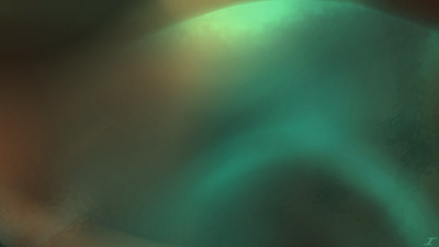
Image
I’m back with another work, and I’ve been getting inspiration from album artworks on the colors to use since some of them just look nice. This one is no different than Somber Rage in that sense, since I used colors from an album artwork to start with, and by that I mean I used two colors and went from there. After some time, I got the end result called Ocean Spray. I again used colors of an album artwork that I like and have been wanting to use those colors for a while. Again I used the classic effects I typically use which are Gaussian Blur, Dents, and Radial Blur, but then I added a Motion Blur in there. I then also flattened the image, copied it, and added that to a new layer, and did Polar Inversion as well as Tile Reflection. The layer blend modes I used throughout are Additive, Lighten, Color Dodge, and Reflect. Additive and Lighten typically brighten the colors, while Color Dodge brings out some of the brighter sections of the image. Reflect then also dampens the image a bit, so

Watermelon Tourmanline

Image
Hello everyone, it's been a while, but I'm back with more art in the coming months. If anyone is an avid viewer of my blog, I'm sorry I took a while off, but I'm happy to say that I feel pretty decent again. Art is typically my therapeutic realm since I use my brain in a different sense than normal, but my job for the last year has definitely taken a toll on me, so I had to step away for a while. I'm back now with a new image titled Watermelon Tourmanline. Since the company I work at changed their name and logo, I decided I’d use the logo colors for this. I also darkened the colors so that they are not the exact colors so as to not run into any issues. I started with some of the green color on the left and applied my classic Gaussian Blur, Dents, and Radial Blur, then did the same thing on the salmon side. I then flattened the image after taking the black background out, copied the image, un-flattened it, then pasted the full image on a new layer. At that point, I a

Festival

Image
I again don't really know what I was going for with this one, but I believe I wanted to make a fall/autumn image with it, but I never really did anything with it. And to give you perspective, this has been sitting since January of 2020, so it's been nearly 3 years! I decided that since I didn't really have much time since things at home are still a bit crazy, I'd slap my trademark on it, and call it a day. This one I titled Festival. From what I can tell from the layer titles (I'm glad I started doing that a long while ago), I started with a bit of green in the middle, and applied a Radial Blur and blended them together with Negation and Darken. I then moved to yellow and applied Radial Blur as well, but blended them with Glow and Overlay. I then did the same with orange, but with Glow and Reflect as the layer blend modes. I then added a full screen of gray blended with Overlay to darken the image a bit, added a few more orange and yellow layers, and then flattened

Evening Horizon

Image
So I'm not sure entirely what I did with this image since I started it way back in June of 2021. Nor did I know what I was thinking, but I just left it as a work in progress until now. I was looking through my images that I have as works in progress, and decided I'd finish this one real quick. When completed, I saw that it looked like a sunset, a super pretty one when the clouds are in the right places in the sky, and the sun reflects just right. I knew then that I needed to title this one Evening Horizon. Based on what I know of the layer titles, I used Gaussian Blur, Dents, Radial Blur, and Zoom Blur to make the base of the image. After I was happy with the colors and positions of everything, I flattened the image, copied it, and pasted it on a few layers. I guess I didn't know what to do at that point, since I left it forever, and I re-did the flattening, copying, and pasting of the image. I then applied Radial Blur and Polar Inversion to some of the full layers as well

Always Remember

Image
Some people remember the events of September 11 really well, and remember feeling terrified, sad, and in shock of what was occurring. I remember the events of that day 21 years ago, but I don't remember feeling that way, mostly because I was a kid in 4th grade, that didn't have a very good understanding of things in that respect. Not sure why I didn't have a more mature brain, and why I was just a kid with a minimal understanding, but I do remember watching on the TV at school and at home the collapse of the towers. My wife wanted me to make an image that depicted that day in an abstract way, and so I listened to a very sad and solemn song to get me in a good place to be able to work on this special and heartfelt image. The process started with a very different image which I have posted on my Instagram. I initially wanted to have fire all around the borders of the image, and then have some hopeful colors come in to play in the middle, and after attempting and failing, I dec

Welcome Home

Image
Hey there everyone, I'm feeling pretty happy and a bit nostalgic. A bit random, but hopefully you don't mind. So at work, I was in a meeting, and saw a chart that had a very cool color palette, so I took a screenshot of the color palette, and decided to use it for art. The art that I used it for was this one, and when I looked at it when it was complete, I pretty much saw a very inviting and warm image. Made me think of home when I was a kid, very warm and inviting, which is why I have titled it Welcome Home. I started with some color going across the screen from the palette, some dark red, lighter red, and orange. I then distorted them all with Gaussian Blur, Dents, and Radial Blur, changing the center with each color. I then added blue on the right and did the same effects. I then added yellow toward the middle, applied the same effects, but duplicated it before applying the Radial Blur so that I could have a bit of a "sun" toward the middle which I made with Zoom B